A Pie chart, or Pie Graphs, displays source data as a percentage of a whole. The complete Pie accounts for 100% of the value being measured and the data points represent a piece, or percentage of the total pie. Pies charts are used when visualizing how much each data point contributes to the entire set of data.
This tutorial will demonstrate how to build a Pie Chart in Google Sheets.
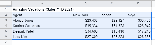
Step 1: Pick the source data that should be displayed in the Pie Chart
Use the mouse to pick the data you would like to include in your Pie Chart.
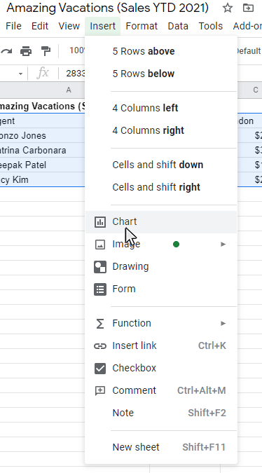
Step 2: Select the Insert option on the main menu, and then select the Chart Option from the submenu
Once the data is highlighted, click Insert from the main menu. Then pick the Chart from the submenu that appears.
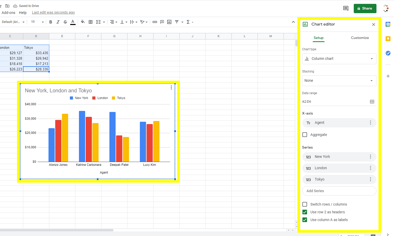
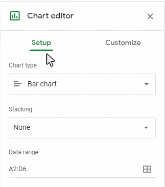
Once you pick the Chart option, a graph will display on the worksheet and the Chart Editor panel will display on the right side of the sheet. The chart type is defaulted to the chart type that Google Sheets identifies as the best fit for the data set picked.
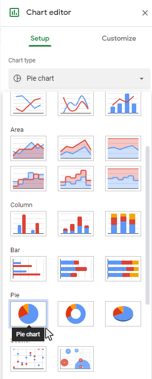
Step 3: Update the Chart type to Pie Chart.
Select the Pie Chart option from the Chart Editor – Setup Tab, then the Pie chart will display on the sheet.
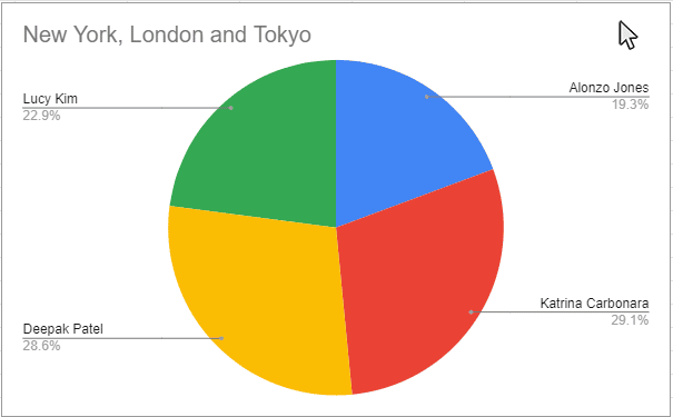
Goal: The Pie Chart will display on the sheet
After you have completed all the steps, the Pie Chart will appear in the active worksheet. Now you can update the chart with chart elements and formatting features to enhance the look of your chart. Please read further for more tutorials on working with chart elements and chart formatting for your Pie Chart.

Pick the Chart Options using the Setup tab on the Chart Editor panel
Step 1: Double-Click on an open spot in the graph to open the Chart Editor Panel
Use the cursor to double-click on an open spot on the graph. This process will open the Chart Editor panel for you to use. Be certain to double-click on an open area on the graph. The chart border around the whole chart will be highlighted. Once the Chart Editor panel appears on the right side of the sheet, it will be available to use and you can proceed with the chart setup and customization.

Step 2: Select the Setup tab on the Chart Editor panel
Make sure the Chart Editor panel is open, then select the Setup tab to use the chart setup options.
Step 3: Adjust any of the Setup Options that you would like to modify on the Setup tab
Google Sheets has several Setup Options available for users to configure their data elements on their chart or graph.
Below is a list of available Setup options for Pie Charts:
- Data Range
- Label
- Value
- Chart Type
- Switch Rows/Columns
- Use Row as Header
- Use Column as Label
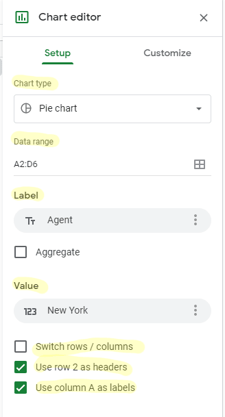
Each chart setup option may be formatted in numerous ways. Once must review the individual feature to see the available adjustments which can be made.
Modify the Pie Chart using the Customize tab on the Chart Editor control panel.
Step 1: Double-Click on an open area of the chart to open the Chart Editor Panel
Use the cursor to double-click on an open area on your chart. This step will open up the Chart Editor panel. Make sure to double-click on a blank area in the chart.
Also: Benefits of an Intranet Software – Detailed Guide
The boundary around the entire graph will be highlighted. Once the Chart Editor panel appears on the right side of the sheet, then the chart setup and customization features are accessible for you to use.
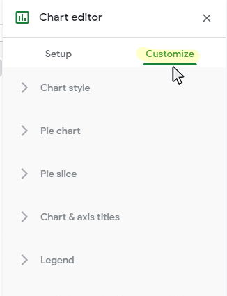
Step 2: Select the Customization tab on the Chart Editor panel
Once you see that the Chart Editor panel is visible, you can click on the Customization tab to view the chart customization options.
Step 2: Select the Customization tab on the Chart Editor panel
Once you see that the Chart Editor panel is visible, you can click on the Customization tab to view the chart customization options.
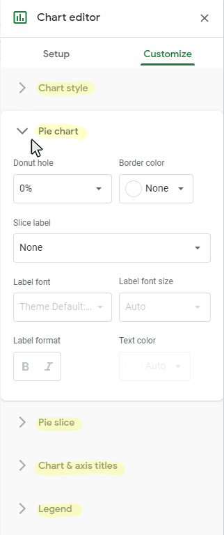
Below is a complete list of accessible Customization options for Pie Graphs:
- Chart Style
- Background Color
- Font
- Chart Border Color
- Reset Layout
- Maximize
- 3D
- Pie Chart
- Donut Hole
- Border Color
- Slice Label
- Label Font
- Label Font Size
- Label Format
- Text Color
- Pie Slice
- Pie Slice Picker
- Color
- Distance from Center
- Chart and Axis Titles
- Title Type Picker
- Title Text
- Title Font
- Title Font Size
- Title Format
- Title Text Color
- Legend
- Position
- Legend Font
- Legend Font Size
- Legend Format
- Text color
All of the chart elements listed above can be configured in a variety of ways. Tutorials on how to add and format each chart elements will be available in the near future.
This tutorial is part of a larger guide offered from Business Computer Skills that covers how to create a graph in google sheets.
Read Also:
What Is Video Marketing and Why Is It So Important for Your Business?

Hello, My name is Shari & I am a writer for the ‘Outlook AppIns’ blog. I’m a CSIT graduate & I’ve been working in the IT industry for 3 years.