Do you ever relate colors to your favorite brands? Or maybe you grapple with staying in a room with conflicting color combinations. Colors are powerful since they can affect a person’s moods and thoughts. Research shows that many people judge a product after a minute and a few seconds because of the color scheme. That is why it is essential to consider the colors you will use on your web products.
The user interface is the first contact users have with your product; thus, you need to make it as appealing as possible to capture their interest. Today, many companies hire GUI designers to ensure their web products are functional and pleasant to the eye. These experts use their skills to incorporate appropriate colors professionally and creatively to convey the brand identity. While you might think a product’s color palette depends on the customer’s preference, it does not. UI experts use a color theory approach to make decisions relating to color schemes.
This article highlights important aspects of color theory and how it affects UI. After reading this guide, you will know how to pick the best color palette for your project.
What Is Color Theory?
The color theory involves following a practical set of guidelines when using color. It is a model that demonstrates the visual impact of mixing colors to achieve appealing results. Color theory helps GUI designers to communicate effectively through impactful color palettes.
When it comes to web development, color plays a crucial role in how users interact with products. Designers can use specific colors to affect how users perceive a particular brand.
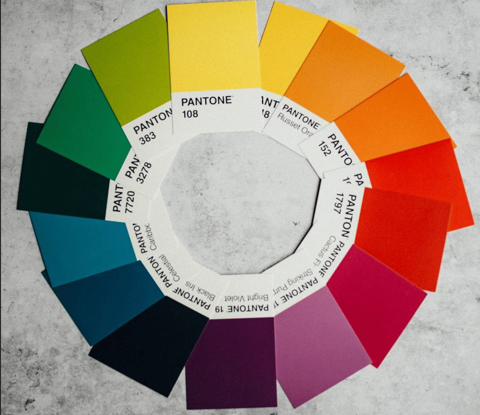
Introduction to the Color Wheel
The color wheel is an essential aspect of color theory and selection. It helps the UI experts to pick relevant colors for your brand.
This wheel is a mix of primary, secondary, and tertiary colors. Once you understand the colors on the wheel, it will be simple to pick the combinations wisely.
Here are common color schemes from the wheel you can use for your UI design:
- Monochromatic
You derive these schemes from one color but use different tones, shades, and tint variations. Since this model has similar colors that rhyme, most users find it more peaceful and serene.
- Analogous
This type of scheme entails mixing interconnected colors. Usually, you must have a dominating color with other supporting accents. Such additions make the UI more appealing and lively.
- Complimentary
This model works if you want to make a brand statement or attract user attention. It entails combining two contrasting colors- a dominant and an accent color. For example, you can use green and red for your user interface project.
Tips to Choose a Color Palette
An effective user interface has colors that resonate with the customers. It is essential to factor in your brand identity and target audience. Now that you understand the definition of color theory and its meaning, let us explore how you can apply this knowledge when choosing a perfect color palette for your UI product.
Extensive Research
Before you start color selection, the first step is to research your target audience. People have different emotional reactions to color, depending on certain factors. For instance, gender, age, culture, etc. Thus, you have to know your target audience, traits, and product expectations. Find out the competitor brands your target customers love and ways to create better designs.
Thus, extensive and structured research will help you get accurate results, and you will streamline your brand story with suitable color palettes.
Credit: Unsplash
Understand the Psychology of Color
After establishing your target audience, you need to study your brand colors and how they affect your customers. As mentioned above, colors have the power to affect your emotions and influence your behavior. You can subconsciously make judgments after glancing at a web product. Thus, what do you want your brand to convey to your customers?
The UI designers know the different color combinations and how they impact an individual’s psychology. For instance, orange is a warm color with positive energy depicting enthusiasm, while green represents nature; it is a fresh and healing color. Red evokes a feeling of danger or love, adventure, and excitement in equal measure.
Therefore, you need to identify your brand colors and what your product stands for before picking the UI colors.
Choose Wisely
You need to reflect on your brand to pick the right colors for inspiration. The color palettes usually have six colors. The dominant color has strong brand associations, while the text color is neutral, and the other four are accents. Thus, choose the dominant color wisely to capture the users. If possible, conduct testing before finalizing the UI colors. It is essential to note that maintaining a harmonious aesthetic is the primary goal.
Apply Color Contrast
Whatever you do, do not allow your UI designers to ignore contrasting colors. It is crucial to add contrast to your interface and bring out distinct features. Products with similar color shades are dull and will bore your potential users. But a UI with a sharp contrast will capture the users’ attention and enhance content legibility.
Thus, the UI designers must understand the sections to use contrast to avoid overdoing it. For instance, the menus or CTAs require contrast to become visible to users.
Maintain UI Standards
Most designers might be more concerned with the visual appeal than the practical aspect. While it is vital to consider the visual appeal, the product must also be practical and accessible. So, follow the UI conventions to avoid confusing the target audience. Some UI rules about color are using dark colors for the content, light schemes of the background, and contrast colors for the accents. Maintaining these conventions will help you develop excellent user-friendly interfaces that enhance usability.
Conclusion
UI designers love to experiment with different color schemes as part of their creative nature. However, it can be a challenging skill to master if you are not careful. The color theory might seem simple, but you need adequate time to study and become a professional GUI expert. Thus, learn the basics before making that important brand decision about the perfect colors.